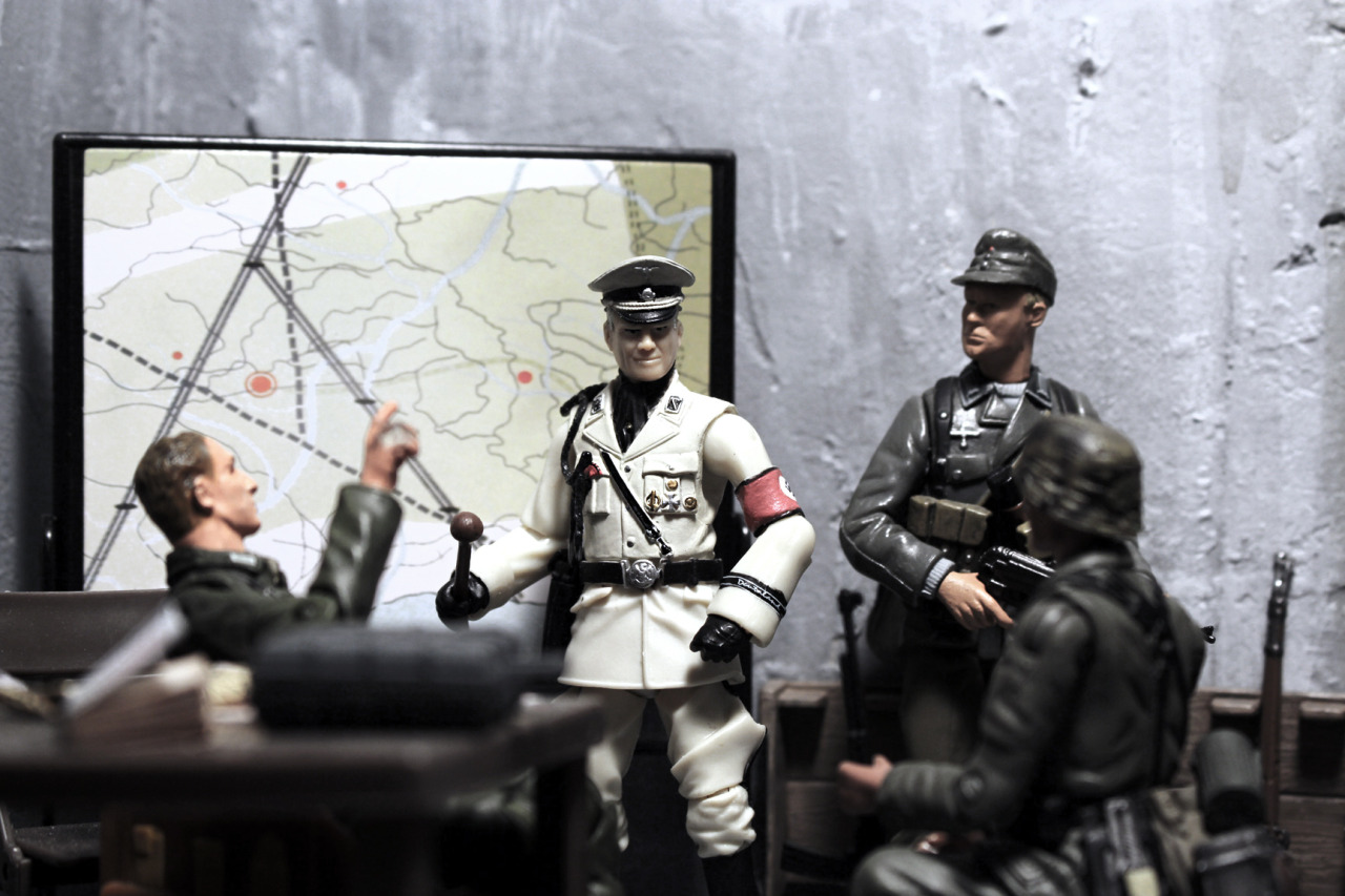
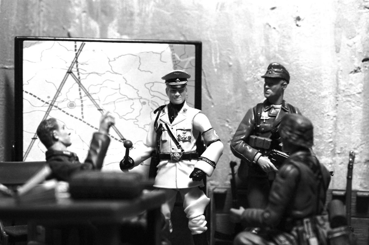
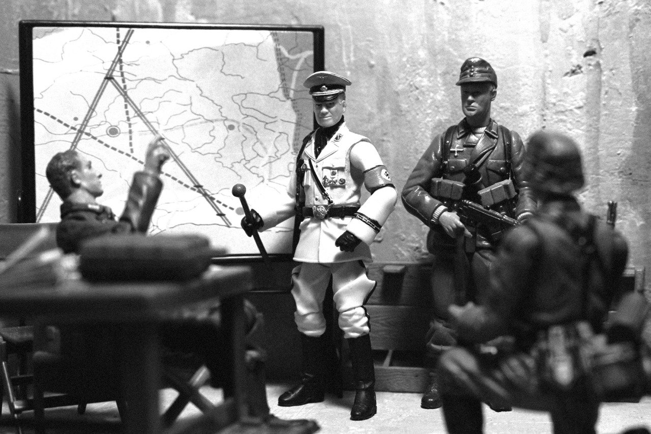
I have various versions of these on my TUMBLR page, including fully saturated and partially desaturated images, but I decided to go with the black and white. Not sure, honestly, if it's the best choice... thoughts?
Scroll down for full and partial examples.
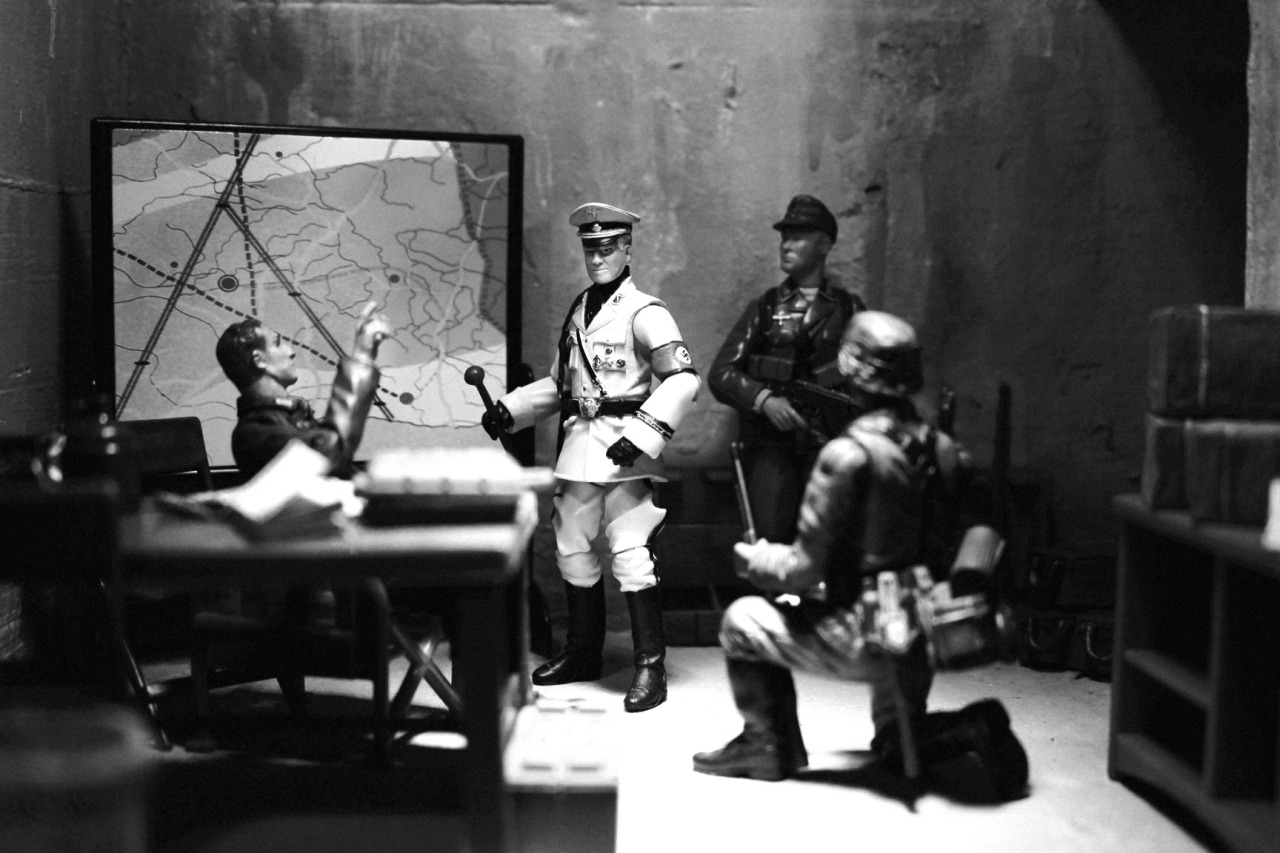
Here's an example of the full saturation:
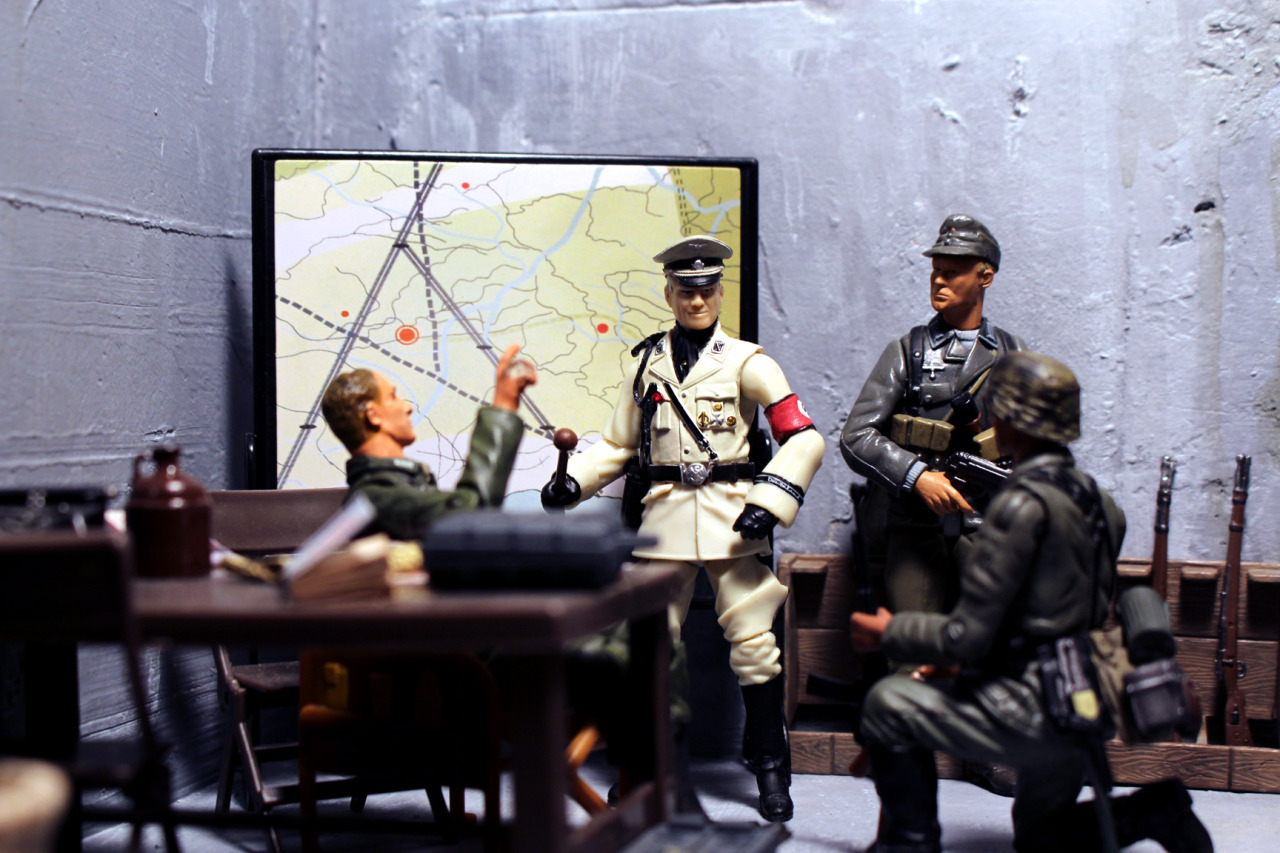
Here's the partial saturation:

Scroll down for full and partial examples.


Here's an example of the full saturation:

Here's the partial saturation:
