On the Workbench
- Thread starter Midget
- Start date
You are using an out of date browser. It may not display this or other websites correctly.
You should upgrade or use an alternative browser.
You should upgrade or use an alternative browser.
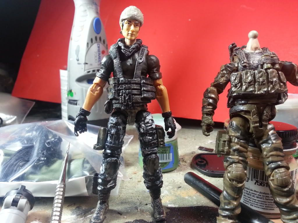
Waiting on some commission stuff to come in, so I'm staring at my Retaliation Flint trying to decide on what classic joe to MUT.
I hate the fact that I got this far and now I'm starting over and am going to try a different method.


Wait, what happened? (Giga.)
I was hoping to finish up a couple figures today with parts from Raginspoon, but USPS has already delivered my letter mail, and no package. Despite the fact that USPS shows "out for delivery" for today. Do they not deliver packages at the same time as letters?
I was hoping to finish up a couple figures today with parts from Raginspoon, but USPS has already delivered my letter mail, and no package. Despite the fact that USPS shows "out for delivery" for today. Do they not deliver packages at the same time as letters?
Well, it's too labor intensive and because the individual sculpted pieces don't line up too well.
I'm going to try sculpting it as one solid piece and then use a series algorithm processes to cut away pieces for my tooling. I don't know if this method will work or if my computer will blow up in the process but this current method is taking way too long.
I'm going to try sculpting it as one solid piece and then use a series algorithm processes to cut away pieces for my tooling. I don't know if this method will work or if my computer will blow up in the process but this current method is taking way too long.
Ah. Well, it looks good, regardless.
Fucking imbeciles didn't deliver the package, at least not to me. I just got the "your package has been delivered!" email which makes me want to strangle our postman. Stupid bastards, this is like the 20th time they've lost a package of mine in 6 years' time.
Fucking imbeciles didn't deliver the package, at least not to me. I just got the "your package has been delivered!" email which makes me want to strangle our postman. Stupid bastards, this is like the 20th time they've lost a package of mine in 6 years' time.
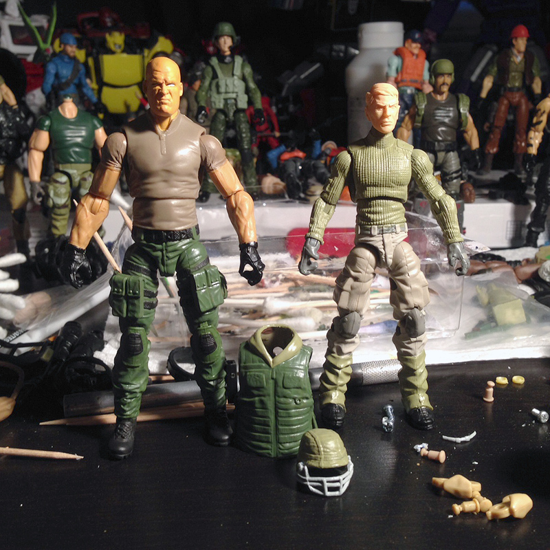
WIP Salvo and Grid-Iron. Still painting Salvo's face (color tone is way too orange, gotta tone that down once the eyes are done), and barely started on the base coat for Grid-Iron, but the bodies are more or less there.
Not sure if I want to paint the shirt darker on Salvo (it's supposed to be brown, not light brown) but I'm planning on using dry-rub decals on him, and I'm afraid that they'll peel the paint off. I also despise painting torsos, but that's still on the table. Instead of the bullet belts all over his pants, I opted to just give him Tunnel Rat's pockets for his thighs, and still debating on what to do for the lower legs. I like the look of the wrapped bullet belts, as silly as it is, but every time I see someone do it, it always looks like gigantic bullet belts glued to the legs. (Which is almost always is, and I don't like that.)
Grid-Iron needs a clearcoat on the green parts, then I'll attempt Giga's digi-camo transfer method on it if my trial run works out. I tried about 10 different leg options, but sort of liked how modern the Mouse/trooper gaiters looked, and those uppers are the only ones that looked right from all angles. So I kept those legs. The tan part, I think I'm going to wind up painting a darker, slightly more yellow tan, but not the color of the vintage figure. That bright shit has to go. I'll post pics with the vest on later, once everything's dried and I can find a belt that works with it, too. I may need to mod the vest to fit tighter, as that torso is fairly skinny. About the only "silly" vintage thing I'm going to keep is his football helmet, but I am probably going to have an alternative as well. (He's listed as a trainer, so I'm going to use him as such for his primary specialty.)
Thoughts?

15-20 minutes of work has netted me this:
http://i61.tinypic.com/2iw1wgm.jpg[/IMG
[IMG]http://i59.tinypic.com/icsdqx.jpg[/IMG[/QUOTE]
This isn't gonna mean much coming from me since I don't know what a cricket bad looks like without looking it up, but I think it looks really good...
[QUOTE="Mandingo Rex, post: 257240"]WIP Salvo and Grid-Iron. Still painting Salvo's face (color tone is way too orange, gotta tone that down once the eyes are done), and barely started on the base coat for Grid-Iron, but the bodies are more or less there.
Not sure if I want to paint the shirt darker on Salvo (it's supposed to be brown, not light brown) but I'm planning on using dry-rub decals on him, and I'm afraid that they'll peel the paint off. I also despise painting torsos, but that's still on the table. Instead of the bullet belts all over his pants, I opted to just give him Tunnel Rat's pockets for his thighs, and still debating on what to do for the lower legs. I like the look of the wrapped bullet belts, as silly as it is, but every time I see someone do it, it always looks like gigantic bullet belts glued to the legs. (Which is almost always is, and I don't like that.)
Grid-Iron needs a clearcoat on the green parts, then I'll attempt Giga's digi-camo transfer method on it if my trial run works out. I tried about 10 different leg options, but sort of liked how modern the Mouse/trooper gaiters looked, and those uppers are the only ones that looked right from all angles. So I kept those legs. The tan part, I think I'm going to wind up painting a darker, slightly more yellow tan, but not the color of the vintage figure. That bright shit has to go. I'll post pics with the vest on later, once everything's dried and I can find a belt that works with it, too. I may need to mod the vest to fit tighter, as that torso is fairly skinny. About the only "silly" vintage thing I'm going to keep is his football helmet, but I am probably going to have an alternative as well. (He's listed as a trainer, so I'm going to use him as such for his primary specialty.)
Thoughts?
[img]http://x4.ofgraphicdesign.com/118th/wip/wip_feb2014.jpg[/img[/QUOTE]
Ugh...that wall of text! :D
My takeaway...that helmet looks really cool!
Ugh...that wall of text!
My takeaway...that helmet looks really cool!
TL;DR!

I was happy with the way the helmet turned out, and currently the face mask stays removable due to it being able to peg into two tiny holes I drilled into the sides. Now, I just hope I don't fuck it up with the camo pattern. I think I'll attempt that tomorrow.
From my experience, dry transfers seem to work better on painted surfaces.
Damn you!
 I just went ahead and painted the shirt a darker brown. Not as saturated as the vintage one, but it's noticeably darker now. Hoping I don't have a lot of trouble with paint rub, but it's the same color essentially, just a lot darker. And of course, hoping the lettering goes on smoothly. At least since the shirt is painted, I will be able to clearcoat it without it getting the plastic all cloudy looking.
Oh and I need a helmet that will fit that larger noggin on Salvo. I was considering just going without, but then I realized the vintage one had tiger stripe camo on the card art, and now I want to tackle that… It'll just need to be large enough to fit that giant skull.
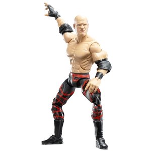
By the way, who is that headcast that I used? I got it from Jesse's site. Is it a wrestler?
By the way, who is that headcast that I used? I got it from Jesse's site. Is it a wrestler?
Oh and I need a helmet that will fit that larger noggin on Salvo. I was considering just going without, but then I realized the vintage one had tiger stripe camo on the card art, and now I want to tackle that… It'll just need to be large enough to fit that giant skull.
By the way, who is that headcast that I used? I got it from Jesse's site. Is it a wrestler?
Looks like Kane? I wonder if the Deluxe Captain America helmet, the one people have used as a Rock Viper helmet would fit it. I think it would be close to the original.
Looks like Kane? I wonder if the Deluxe Captain America helmet, the one people have used as a Rock Viper helmet would fit it. I think it would be close to the original.
Is that the red helmet with black visor? I actually have that piece of shit figure for some reason, and if so, then nope. It barely fits a Joe head.

Yep, looks like Kane. Wonder if it's one Jesse scaled down? I had to carve off quite a bit of neck but it works pretty well on that huge Rockblock torso. It's about the same scale as Repeater.
The only REALLY large helmet I can think of is 25th Breakers
Hmm… That could maybe work, with a chin strap and visor?
Ooooo! That's ^^ a great idea!...I had forgotten about him...
Hey MR, have you considered the vintage Salvos helmet?...the ARAH heads noggins were huge, so maybe it'd fit that big noggin you're using..
Hey MR, have you considered the vintage Salvos helmet?...the ARAH heads noggins were huge, so maybe it'd fit that big noggin you're using..
Last edited:
Ooooo! That's ^^ a great idea!...I had forgotten about him...
Hey MR, have you considered the vintage Salvos helmet?...the ARAH heads noggins were huge, so maybe it'd fit that big noggin you're using..
I thought about it, but I kind of want a translucent visor like the cartoon. Still debating on the helmet. I kind of like the bald look!
I slept like shit last night so I didn't really put in as much work today as I wanted, but what little I did took for damned ever. I was able to track down the office manager, who opened the mailboxes and got my package out of the wrong mailbox.
 Dumbass mailman put it in the one beside us (ours is the last apartment number, the office is 1 above it). Which nobody ever checks, because we don't have a full-time office manager right now. I just lucked out and thought of that possibility and sure enough, my Raginspoon order was there. Crisis averted!
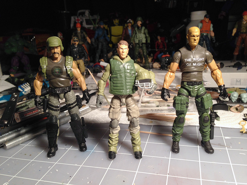
 So I decided to just chop off the foot guard and leg wraps on those Destro shin plates, and glue them directly to the legs. They look way less bulky that way. I'll paint them charcoal to match his kneepads, and add a little weathering to them. Backblast is mostly done, I'll fiddle with him a little more.
Grid-Iron I just pieced together so you could see him. I painted the head and eyes, just need to highlight his hair and add pupils. I didn't feel like hassling with Giga's transfer system on such little sleep, so I'll tackle that later in the week. I am going to wait to see how the digi-camo looks, but right now the pants are just too light. They blend too much into the gaiters.
And Salvo, I finished up painting the shirt, edging out all the areas that rubbed and sanding/cutting them down, and then did the lettering. Boy, was that a bitch. I wish I'd shifted the bottom row of text left just a little but it turned out better than I'd feared. I wasted 2 "F" letters, though, I used 3 of the 4 I had.

They are looking good. There are a lot of good designs in the 90's line that are often overlooked. Sure there are quite a few "out there" designs, but many of the designs fit right in with the aesthetic of the 80's figures.
Thanks. With almost all my 89-90's customs, I've just tweaked the colors to not be so ridiculous. Bright yellows and neons become tans and earth tones. With that minor fix, a lot of those guys fit right in. I'm not as happy with Backblast's colors, since he's sort of a hybrid of V1/V2. Something about him isn't settling right with me just yet. I think it's the pants or lack of brown?
I always liked both Salvo and Backblast. Now I want to do customs of both.

Attempt number 2 underway:

I thought my first one was large, so I decided to put on my big boy hat and actually pay attention to the fucking article. I originally thought the maximum blade length could not exceed 38", but that's the overall length.
And here we have the initial results. Scaled out it should be just north of 2", but I making it a bit longer.
^^ Yeah, next the bat! the first attempt does seem rather monstrous...
Funny as I think BB looks like the best of the bunch...the most "factory" looking...
... I'm not as happy with Backblast's colors, since he's sort of a hybrid of V1/V2. Something about him isn't settling right with me just yet. I think it's the pants or lack of brown?
Funny as I think BB looks like the best of the bunch...the most "factory" looking...

Working on a 4 man Arctic Fire Team
2 are pretty much done...3rd and 4th in works...
Not much, once I get it right. It's still considerably longer than my McF Playmaker baseball bat, which seems to be right, length-wise. It's also too wide.

Yeah. Should be slightly smaller than a baseball bat. Not by much though.
... but I don't trend towards being a jackbooted scale thug ()
Heyyy... I resemble that remark.

Ha^!
Currently painting up a MU buck to resemble a body builder wearing a speedo. Don't ask, don't tell
Currently painting up a MU buck to resemble a body builder wearing a speedo. Don't ask, don't tell
